
Victor Oladipo may be the best wing defender in this draft, but he is not without weaknesses that NBA scouts/execs are noticing with the help of Vantage Stats. Crowding shooters and getting a hand up without fouling is vitally important to effective defense. In fact, we have already shown that in certain situations it will drop FG% by a full 10%. Utilizing a few of Vantage’s innovative shot defense metrics, let’s take a look at 5 prospects that will be called upon to defend the wing in the NBA: Victor Oladipo, Ben McLemore, Otto Porter, Shabazz Muhammad and Michael Carter-Williams.
Contest+
Vantage tracks 6 levels of shot defense, including block, alter, and contest (defined as when the defender is within 3 feet of shooter and his hand is up). Contest+ is the percentage of shots defended where player blocks to possession, blocks to opponent’s possession, alters, or contests.
 Points Allowed Per Shot & Fouls Per Shot
Number of points allowed per shot defended includes free throws resulting from fouls and thus penalizes a player with a high Fouls Per Shot number.
Number of shots defended per defensive chance measures defensive activity and therefore gives context to box score counting stats in which level of activity is key.
FG% by opponents on all shots defended.
The Numbers
Here is what NBA teams utilizing Vantage are seeing in the numbers from Oladipo, McLemore, Porter, Muhammad, and Carter-Williams:
Analysis
The numbers seem to highlight some weaknesses for Oladipo in shot defense – his foul rate is high and he allowed shooters to go almost 39% against him. As a result, his Points Allowed Per Shot was .897. To provide further context, Tony Allen allows .894 Points Per Shot against NBA-level talent. Giving up a higher number of points to college shooters does not bode well for a player touted as an NBA-ready defender. However, a mitigating factor is his high Shots Defended Per Chance number and his high help rate (only Otto Porter averaged more helps per chance). Thus, a lot of his points allowed were not when guarding his primary target.
We can’t let Oladipo off the hook completely though. Watching the video of his non-contested defense shows him relying on his active hands too much in help rather than playing with his feet, merely waving as guys go by, and he needs to temper his aggressiveness (especially when tired) so that he gives up fewer good looks. Oladipo exhibits the capacity to become a good NBA defender, but he is not there yet.
Keep checking in or follow us on Twitter as we continue to introduce new statistics in the following 10 categories:
1) Scoring
2) Facilitation
3) Rebounding
4) Screening
5) Turnovers and Fouling
6) Shot Defense
7) Disruptions
8) On-Ball/Screen Defense:
- Keep in Front % (KIF%)
- Close Out Points Allowed
- Points Allowed Per Screen
- Effective Screen Defense Rate
9) Help/Double Team Defense
- Helps Per 100 Chances
- Double Teams Per 100 Chances
- Points Allowed Per Help/Double Team
- Effective Help/Double Team Rate
10) Movement and Involvement
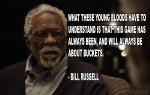
“Always Will Be About Buckets”
If you haven’t watched the Uncle Drew series starring Kyrie Irving, and more recently featuring Kevin Love and Hall of Famer Bill Russell, you need to because as Russell reminds Uncle Drew, This game always has, and always will be, about buckets.
A look at the move (here at Vantage Sports, we call these “post-acquisition moves”) just prior to a shot attempt yields insights into how to get buckets.
We first looked at the frequency of post-acquisition moves that led to field goals in the league by looking at the number of field goal attempts after a particular move. Catch and shoot field goal attempts take up the majority of field goal attempts, but for purposes of our analysis, we will not consider them a post-acquisition move. The dominant move is a drive to the right or left (approximately 20% of the time). Ball screens are the third most popular move where the dribbler comes off an on-ball screen. Listed below are all of the post-acquisition moves that Vantage Sports tracks in the data set, sorted by frequency of field goal attempts. The breakdown between two-point and three-point field goal attempts follows.
 Most post-acquisition drives lead to 2PT field goal attempts, while ball screens are generally given to help create space for a three point field goal attempt. These findings also show that crossovers, a move Uncle Drew uses to drive straight to the basket in Episode 2, is also used in the NBA to set up more two point field goal attempts (approximately 3.5 crossovers for two point field goal attempts for every crossover leading to a three point attempt).
Looking at the most frequently used post-acquisition moves, we can see what the average field goal percentage is after a certain play is made.
Clearly, the best option is a catch and shoot scenario, but let’s dive a bit deeper into the data.
The Moves of Diminishing Returns
One shot fake is not as successful for three point field goals as it is for two point field goals (28.63% for threes versus 42.47% for twos). It is to be noted that one shot fake is the post acquisition move that leads to the most frequent fouled three point attempts (besides catch and shoot attempts).
With shot fakes and jab steps, less are better. The diminishing return on these moves are apparent in the field goal percentage numbers that you see. One or two shot fakes compared to three or more is approximately a 4.25% decrease in field goal percentage. The drop is even more prevalent in jab steps, where one jab step could help effectively earn you 38.70% shooting, but two drops the field goal percentage to 36.84%, and in the rare cases of three or more jab steps, 18.18% shooting from the field.
Facing up the defender (after posting up) from below the arch will generate further from average two point field goal percentage (approximately 6.88% below the average two-point field goal percentage). The percentage gap ticks from beyond the arch to 3.86% below the average. This suggests that despite facing a primary defender in these situations, face ups are lower percentage shots when closer to the basket.
Which Move Is the Best?
Like in other studies, the more frequent observations help make up more of the average, so without consideration of the number of observations of a particular move, the top moves that result in the highest field goal percentage, excluding fast break and catch and shoot opportunities for both the 2 PT and 3 PT options, are as follows:

Keeping in mind that jump stops and 2 jab steps combine for less than 2% of the total number of three point field goals in our sample, it is clear that ball screens are the most optimal post acquisition move for creating a high percentage 3 point shot.
The Euro step has broken into the game in a big way and the numbers show why as it is more effective than straight drives, jump stops or spins.
This data show just how hard it is to get buckets in the NBA when attempting to create one’s own shot.
Professional and Collegiate Teams The Future of Scouting, Player Analysis and Team Management


Visualizing Vantage’s Metrics
For teams that have more points (which are just individual games) in the upper right of the graph, they will be switching on screens a lot while still remaining effective defending screens. Theoretically, these teams will need versatile defenders who can guard multiple positions to be able to effectively switch on screens. As you can tell from the graph, not many teams switch on screens very often. One team that is pretty interesting is the Knicks, who might come the closest to having a number of points in the upper right corner. They certainly appear to switch on screens more than most teams while still playing effective defense on screens. Another interesting team is the Nuggets, who appear to have a number of random points all over the place. Their graph appears to be the most spread out (they switch sometimes, other times they don’t switch, they also play good and bad defense on screens). Finally, it’s worth remembering the scale of this graph which goes from 0 to 0.4 with some occasional games near or above 0.5. However, for almost all of the games, switching on screens is the less likely event.
Let’s take a closer look at the graph above with a subset of 6 teams (the Bulls, Celtics, Clippers, Heat, Lakers and Thunder).
Each team is fit with a regression line as well as a shaded region that includes the 95% confidence interval for the fit. For most teams, we see that an increase in switch% on screens leads to a decrease in Effective Screen% (Effective Screen Defense Rate). However, what this graph is really great for is that we get an idea of the magnitude of the decrease in Effective Screen% (Effective Screen Defense Rate). For example, the Lakers are significantly worse defending screens the more they switch but a team like the Thunder plays pretty consistent screen defense whether they switch or not. In fact, we can see a slight increase in their regression line when they switch on defense (meaning they play better screen defense when they switch).
Defending the Three
Before Paul George broke out as an offensive force, he was widely known for his suffocating defense. But is he a good enough defender to make shooters miss wide-open threes? 

That was a trick question. Of course not! This video is not an example of good defense but rather Paul George getting lucky that an open shooter missed a wide-open shot.

In a previous article, I developed a framework for calculating defensive XPPS based on Ian Levy’s Expected Points per Shot. Let’s apply this method but focus specifically on three-point shooting and determine which players are getting lucky. Have Paul George’s opponents missed a ton of open shots?
In order to understand what constitutes an open shot, let’s revisit some of Vantage’s definitions for shot defense.
Steve Novak’s Defense – By The Numbers
Steve Novak’s defensive abilities have recently been the subject of some debate. Synergy says he’s good, and 82games says he’s not. Our numbers say they’re both right, partly. 
We can measure defensive ability across many different categories, including:
a) how well he keeps opposing drivers in front of him (keep in front% or KIF%)
b) how well he contests, alters, or blocks shots (Contest+%)
c) opposing players’ field goal percentage when he is defending (FG% Against)
d) how well he double teams (Double Team Effectiveness Rate or DBL)
e) how well he helps on defense (Help Effectiveness Rate or HELP)
A) Keep in Front
In our sample (which includes the final quarter of last season and a little less than half the games played this season), Novak’s KIF% is 56%. This includes all situations, from screens to closeouts to isos. This puts him below the median for the Knicks, a little better than the league average, and just about 10 percentage points higher than Kobe Bryant (with apologies to morning radio hosts who still think Kobe is an adequate defender).
B) Contest+
Our data has already shown the importance of getting a hand up on shooters. At 38%, Novak’s Contest+% is average for the Knicks but toward the bottom of the league.
C) FG% Against
Novak at 42.11% is average in this metric for both the Knicks and the league.
D) Double Team Effectiveness
 DBL measures all attempted double teams as well as outcomes deemed effective (no points, no assist, etc.) and ineffective (assist, pass to open shot, crucial pass, foul, points). At only 6% DBL, Novak is the worst double team defender on the Knicks and watching the film is a painful experience. Novak’s inability to double quickly allows offenses to easily find open shooters. Furthermore, Novak allows opponents to split his double team once every 5 attempts. This precipitates a complete defensive breakdown.
E) Help Effectiveness
HELP measures all attempts to help a teammate after a No Keep in Front and again takes into account effective (no points, keep in front, no assist, etc.) and ineffective outcomes. At 12.5% HELP, Novak is again the worst Knick.
Conclusion
What these metrics tell us is that if one were to look only at Steve Novak’s on-ball defense, he’s definitely adequate and even above average in some important categories such as KIF%. But the full picture shows that because of his inability to effectively help or double team, he becomes a liability on the defensive end. Because his weaknesses lead to points scored on his teammates, defensive ratings that only account for points against will not accurately measure his overall defensive value
The Intersection of Shot Defense, Location, and Clock (DLC)
Is it better to shoot early in the shot clock? What if the shot is contested, is it still better to shoot early? How does shot location influence the decision to shoot? Is it better to attempt an open mid-range shot early in the shot clock versus a contested shot near the basket late in the shot clock?
These are likely some of the decisions going through players’ minds when they decide to shoot, even if they don’t realize it. The last example is particularly interesting because it gets at the crux of shot selection: the player has an open mid-range shot, but is it worth passing that up to get a potentially contested shot near the basket later in the shot clock?
There’s been previous research into whether teams should be shooting early in the shot clock. However, we can take this a step further and look at the shot defense faced. WARNING: this will be a lengthy exercise but there will be a number of visuals to help you along.
First, before we start, I suggest refreshing yourself on the definitions for each type of shot defense. You can find that here. Done? Let’s start off by looking at how FG% changes given the time in the shot clock and the type of shot defense.
Note: Shot Clock values are time remaining
As we can see in the graph, the earlier you can shoot in the shot clock, the more likely you are to make the shot. This is true for basically all forms of shot defense (the exception being altered, where the sample size is pretty small and filled with bad shots taken after shot-clock resets often in desperation). Is there a particular reason for this? Certainly, we can posit that players rush their shots at the end of the shot clock, which may lead to the diminished FG% (labeled Panic Room in the graph). However, what about the increase in FG% even as we get away from the “late in the shot clock” area? Well, one reasonable assumption is that players who shoot early in the shot clock are likely in transition (labeled Transition in the graph). It could be that a majority of the open/guarded/pressured shots that are being taken early in the shot clock are shots that are close to the basket causing a higher FG%. But what about the contested shots? Whether the player is in transition or not, a contested shot has a lower chance of going in, especially near the basket.
There are a few issues with the graph presented above: first, there is no adjustment for the 3 being worth one more point. This is easily correctable: we’ll look at points per shot instead
The graph above looks mostly the same with the differences between open and contested shots better defined. The second issue we have with both graphs is that the sample size on the ends are considerably smaller and it’s particularly clear with altered shots where there were only four altered shots taken at 24 seconds in the shot clock. This is why you see that big nosedive for altered shots at 24 seconds. So let’s fix this issue by creating 5-second bins for each type of shot defense.
The graph is below:
We can see that regardless of shot defense, if you shoot earlier in the shot clock, the PPS goes up. There is also a drastic increase from the 16-19 seconds to 20-24 seconds bin for guarded, open and pressured shots. As I alluded to earlier, it’s likely that many of those shots are occurring close to the basket in transition. So we’ll need to break it down even further by shot location. But before we do that, I think it’s important to note that for altered and contested shots, we still see a steady increase in PPS as you shoot earlier in the shot clock. It’s possible that a lot of the shots in the 20-24 second interval are still in transition but because the shot is being contested, I’d argue a shot in transition is irrelevant. We know contested shots near the basket have a much lower chance of going in.
Before we break down the graphs by shot location, let’s first look at the distribution of shot defense at each second:
This graph may seem a bit confusing but what the graph shows is approximately 50% of the shots taken at one second were contested while almost 20% of the shots taken at one second were pressured. If you add up all the points for each level of shot defense at one second, it will be 100%. So what does this graph tell us? The majority of the shots taken are contested and as the shot clock winds down, the rate of contested shots goes up. In regard to the end points (such as 24 seconds), keep in mind the sample size for these points are going to be much smaller so that’s why you see some odd spikes or nosedives at that time interval.
Now let’s move onto looking at the shot clock and shot defense with respect to the shot location. As I mentioned earlier, it’s likely that a lot of the guarded, open and pressured shots early in the shot clock were coming near the basket in transition.
So we can remove the shots that were near the basket and look at only mid-range shots and three point shots. This should essentially remove the effects of transition offense since most players attack the basket in transition.
Again, we can see that shooting at the end of the shot clock is not recommended. However, perhaps what is most interesting is that at one second, the chances of making the shot are essentially the same across all levels of shot defense. The sample size is not ideal– about 220+ shot attempts for open and guarded– but it’s large enough that we should feel comfortable drawing some conclusions. If you are wondering why the graph only goes to 23 seconds, it is because I removed shots taken at 24 seconds due to a very small sample size (22 total shots).
Let’s also take a look at the distribution of these shots at each time interval:
Like the first graph, we see that the majority of shots taken from mid-range or three are contested.
Now, let’s look at mid-range shots and threes separately since the value of each shot is significantly different. First, we’ll look at the dreaded mid-range shot. How does FG% vary for mid-range shots over time in the shot clock?
We see that FG%’s decline as the shot clock winds down with the exception of open and guarded shots at one second. However, the reason for this is simply due to a small sample size– less than 100 shot attempts for both open and guarded shots at one second. In fact, we have some sample size issues on both ends of the graph so let’s look at the same graph but with five second binned intervals:
We’ve removed some of the sample size issues from the previous graph (although as you can tell, there are still some issues with guarded and open shots from 20-24 seconds, where fga is 140 and 165, respectively) and we can continue to see that it is advantageous to shoot earlier in the shot clock. In fact, contested mid-range shots taken with 16-24 seconds remaining are more likely to go in than guarded shots taken with 1-5 seconds remaining and almost as likely to go in as guarded shots taken with 6-10 seconds remaining.
How about the distribution of shots taken at each second
Again, we see that as the shot clock winds down, we see more and more contested shots taken. After looking at this graph, I’m sure you are left wondering how often is the “worst shot” taken? (If you are wondering what the worst shot is, it’s a contested mid-range shot taken with 1-5 seconds remaining) Over the last two years of shots that Vantage has tracked, the “worst shot” was attempted 4% of the time. If we include pressured mid-range shots taken with 1-5 seconds remaining, that number jumps to 5.2%.
Let’s move on to exploring three-point shots and how the FG% varies over the shot clock. Like before, we’ll look at the FG% for the different types of shot defense:
This is the first graph where we can’t really see any effect of shooting earlier in the shot clock. We do see that in the 1-5 second bin, FG% is at its lowest. However, there is no trend among any of the other bins. So if a team wants a three, it does not matter when in the shot clock they shoot it. Another interesting conclusion we can draw is that there seems to be a significant difference in the FG% for shots taken in the 1-5 second bin across each level of shot defense. We see that going from a contested three to a guarded three can raise your FG% by about 7% and going from a guarded three to an open three can raise your FG% by 5.5%. So if a shooter is able to get a wide open three within the last five seconds of the shot clock, it will still be very beneficial to the offense. We also see that a guarded three taken in the last five seconds of the shot clock doesn’t have a much higher chance of going in than a pressured or contested three taken earlier in the shot clock.
Let’s look at the distribution of shot defense at each time interval:
Finally, let’s look at shots close to the basket. When looking at the FG%, keep in mind that many of the shots early in the clock may come in transition. However, if the level of shot defense is the same, should the shot being in transition really inflate the FG%? I’ll let the reader decide when looking at the graph.
This graph may be the best visualization of the research conducted in my first article. The difference between getting a contested shot near the basket and a pressured shot near the basket is night and day. And the difference between getting a pressured shot and an open shot (which will mostly be layups or dunks) is also night and day. In regard to the shot clock, there doesn’t appear to be any difference between getting an open shot early in the shot clock as opposed to late: it’s about a 90% proposition either way. This isn’t entirely surprising since a dunk with five seconds left in the shot clock is as likely to go in as a dunk with 20 seconds left in the shot clock. However, there is a difference for every other level of shot defense. We see that guarded shots taken early in the shot clock are as likely to go in as open shots taken late in the shot clock while pressured shots taken early in the shot clock are as likely to go in as guarded shots taken late in the shot clock. We also see that the FG% for contested shots seems to gradually increase as well. Still, like many of these graphs before, we do have a bit of a sample size issue (especially the guarded and open shots). So let’s look at the same graph with five second binned intervals:
This graph is a bit easier to interpret and we see that for every level of shot defense with the exception of open shots, FG% goes up as you shoot earlier in the shot clock. We can also see that as you move “up” each level of shot defense, a player is more likely to make the shot.
As we’ve done before, let’s look at the distribution of shot defense at each time interval:
This graph is different from some of the past ones we’ve looked at. Early in the shot clock, there are actually more pressured shots attempted than contested shots. There are also more open shots attempted early in the shot clock. Like the past graphs, the rate of contested shots goes up as the time on the clock elapses. Players also foul less as the shot clock winds down- clearly a bright idea. Although it is interesting that block rate increases as the shot clock goes down. Despite the higher rate of blocked shots, players are still able to foul less.
Let’s answer some of the questions posed at the beginning of this article.
Is it better to shoot early in the shot clock?
I think the evidence certainly points to this. However, for three point shots, there doesn’t appear to be any advantage for shooting early.
What if the shot is contested, is it still better to shoot early? How does the shot location influence this?
At first glance, it is certainly never a good idea to shoot a contested shot. However, for mid-range shots and threes, there is a cutoff point where contested shots early in the shot clock are basically as good as guarded or open shots late in the shot clock. For mid-range shots, that cutoff appears to be around approximately 10 seconds. For threes, that cutoff point only applies to guarded shots and occurs at around approximately five seconds. Of course, I’m only eyeballing the cutoff point based on the binned graphs so it would be an interesting exercise to determine the exact cut off point. But to answer the question above, it is not better to shoot a contested shot early. However, if you are going to wait for the shot clock to go all the way down, you may as well shoot that contested shot.
Is it better to attempt an open mid-range shot early in the shot clock versus a contested shot near the basket late in the shot clock?
We can take this last question one step further and look at contested threes as well. In order to compare the three types of shots, let’s look at our last graph:
In looking at the graph, it is pretty clear that open mid-range shots are never preferable over contested threes or close shots. However, at each end, we do see that the PPS for contested threes and open mid-range shots are nearly the same. If the shot clock is winding down to near zero, it isn’t a horrible idea to step in a few feet and shoot the mid-range jumper. Likewise, if you have an open mid-range shot early in the clock, instead of stepping back and risking it being contested, you may as well take the open shot. Otherwise, contested threes and contested shots near the basket are better bets than open mid-range shots.
Unfortunately, for those clamoring for the mid-range shot to remain a big part of the game, there isn’t much here to support your claim. In fact, the evidence here seems to point to mid-range shots being completely abandoned. Still, it is important to break this down further by each specific shot location. Perhaps there are areas of the mid-range game where shooting an open shot is better than shooting a contested three/close shot. Additionally, each player is going to have different percentages. While the league as a whole should be shooting less mid-range shots, for a specific player, this graph may look much different.
Also, since I mentioned that the league should be shooting less mid-range shots, what exactly does the distribution of shots look like?
As expected, the rate of close shots goes down as defenses are able to set up and protect the basket. We also see the rate of mid-range shots increase till about 15 seconds at which point it levels off at around 40%. Instead, we see the rate of threes increase as the shot clock winds down.
Bonus question: What about contested threes versus contested shots near the basket?
Perhaps the more interesting part of the first graph is looking at contested threes versus contested shots close to the basket. If we look at the best fit lines (the solid lines with no points) for contested threes and contested shots close to the basket, we see that contested threes are preferable to contested shots near the basket from about 19 seconds remaining to about 5 seconds remaining. However, if it is either early in the shot clock or late in the shot clock, it is better to shoot a contested shot near the basket than to take a contested three.
If you have any questions, comments or suggestions, please reach me on twitter @knarsu3
Note: Shot locations were defined as followed:
Close shots were shots taken in locations t,u, and v
Threes were shots taken in locations a, b, c, d, and e. Locations aa, bb and cc were removed due to them being past half-court.
Mid-range were shots taken in locations f, g, h, i, j, k, l, m, n, o, p, q, and r
Shots in locations s and w were ignored due to not really fitting in any category. The total shots taken from those locations were about 130 apiece i.e. not a significant difference.
The Value of Contesting Shots
The idea is not to block every shot. The idea is to make your opponent believe that you might block every shot. -Bill Russell
Bill Russell is one of the all-time greats in basketball. His shot-blocking ability is legendary and the NBA has never seen a player like him since. The heart of Russells quote is about effort: the daily grind of contesting every shot.
Until recently, we had no dataset that could separate the grinders from the slackers, the everyday from the spotlight-seekers. Dwight Howard is widely considered to be the player most similar to Russell, one of the best defenders in the NBA.
But Dwight is no Russell. Despite the high rate of blocks, he doesn’t contest shots nearly enough. And the difference between not contesting a shot and contesting it is huge. To examine how huge, we go to the numbers.
Vantage tracks every level of shot defense, including contested and pressured shots. Contested shots are defined as being within three feet of the shooter while getting your hand up. Pau Gasol contesting a shot:
Pick-and-Roll Defense: The Switch
The pick-and-roll is one of the most common actions youll see across the league. How a defense handles the pick-and-roll goes a long way in determining how effective most offenses can be. Using Vantages dataset from this season and last, lets take a look at how teams employ one of the more unique pick-and-roll defenses: the switch.
The table below shows the how NBA teams defend on-ball screens. On most occasions, a defense will provide some level of help (hedging or retreating into the paint), and then expect everyone to recover to their original defensive assignments. The Wizards have employed this strategy the most (72 percent of the time) across this two-year period. A defense can also double team the man coming off of the ball-screen to try to create a turnover or force the ball out of the ball-handlers hands. This has been most popular with the Bucks, who double team the ball-handler on about 30 percent of ball screens. Finally, defenses can simply switch on the screen. The defender that gets screened doesnt try to stick with his man, instead he guards the screener, while the help defender guards the ball-handler. The Knicks lead the league in switches.
Powered by Tableau
Some coaches dont like switching because of the mismatches it creates; having your bigs guarding the perimeter and your guards defending the post is not ideal. But depending on your personnel, it can be a good option. If your point guard is too slow to maneuver around screens, switching can be your last resort. If a team is stocked with similarly-sized players and/or a mobile frontcourt, those mismatches created in a switch may not be mismatches after all. Lets take a look at how often teams are switching and how effective their defenses are.
 The table below shows how successful teams are when they switch on pick and rolls. The first column shows how often teams switch ball screens, its the same data as in the table above. The next two columns show the results of those switches, whether they be good or bad. For our purposes, we are considering good defensive play to be a forced turnover, a contested shot, or not allowing any event, such as a shot, assist, foul, etc. A bad defensive play is allowing an open shot, a made shot, an assist, or committing a foul. The fourth column shows how often the defense forces a turnover when switching.
Some takeaways from the data:
- For the most part, the teams that do the most switching are the most successful at it. The Knicks, Warriors, and Nuggets lead the league in ball screen switches and are all above average at defending when they switch. Each team may have different reasons for their switches. The Nuggets have an army of athletic swingmen, which is perfect for switching, while the Knicks point guards can be a bit limited on defense and may have trouble fighting through screens.
- The Knicks, under Mike Woodson and Mike DAntoni, have been the the most likely team in the league to switch defensive assignments on a ball screen. This is for good reason, as they are also the team with the most good defensive plays on switches. They arent masterful at forcing turnovers or contesting shots, they simply dont allow shots; no event occurs on 52 percent of their switches.
- The Lakers and the Wizards are also quality defenders after switches, but they do it in a different way than the Knicks. Offenses are more likely to get off a shot against Los Angeles or Washington, but these two teams have been the best at contesting those shots.
- The Dwayne Caseys Raptors are the rarest switchers in the league, but they arent particularly bad when they do. Because Andrea Bargnani has struggled so much with help defense, it might be wise to employ more switching to reduce help defense-related mistakes.
- The Bucks and Kings play the worst defense when they switch, but at least Milwaukee has limited the amount of times that they switch. The Kings, on the other hand, switch ball screens an above average amount of the time. After a switch, the Kings give up an open shot to either the ball handler or another player more than 25% of the time.
- The Hawks and Heat are the best at stopping the ball handler from shooting after a switch. Both of these teams have utilized smaller lineups with some success, and having Lebron James, Josh Smith, or Al Horford switching on to your point guard can be much scarier than facing the average big man switch.
- The Grizzlies are the best at forcing turnovers after switches. That should be no surprise, as they are usually among the best in the NBA at forcing turnovers in general. Known for his quickness despite his size, Marc Gasol has forced turnovers on 10 percent of his switches.
Overall, switches are sparingly used across the league, but there are a few teams that utilize it more than others. Looking at lineup data combined with pick-and-roll coverage data could provide a window into how coaches regard the defensive abilities of their players.
Jason Collins’ Revelation and the Top Screeners in the NBA
Jason Collins said something last spring that we here at Vantage Sports have been waiting to hear an NBA player admit for a long time. Spoiler alert – it had nothing to do with his sexual orientation.
“My contributions don’t show up in the box scores.” 
What Collins meant is that his game involves moves that improve other players’ box scores. As he explains, “I set picks with my 7-foot, 255-pound body to get guys like Jason Kidd, John Wall and Paul Pierce open.”
 Screens are crucial to every team’s success. Screens are the only tool a player has to legally contact a defender, creating space for a teammate to either score or facilitate a score. Collins’s abilities have been rewarded with an NBA salary for more than a decade, yet have never been effectively tracked or measured. Notice that there is no “effective screens” line item in your NBA box score. Vantage Stats changes that by measuring both screening effort and efficiency.
Solid Screen % and Screens Per Chance
A good screen requires more than a big body (or as John Stockton proved, a not-so-big body). The fundamental job of the screener is to create space either through contacting the defender or forcing the defender to adjust his path.
Vantage tracks a player’s “Solid Screen %”. This is the percentage of set screens (both on-ball and off-ball) where a player either makes contact with a defender, or re-routes that defender. This statistic excludes slip screens (times where the screener rolled or popped prior to the receiver getting to the screen).
Here are the top 5 NBA big men in Solid Screen % over the past two seasons (with minimum offensive chances and screen attempts) along with their Screens Set Per Chance:
1. Ronny Turiaf (79% Solid) (.49 per chance)
2. Nick Collison (78.3% Solid) (.44 per chance)
3. Marcin Gortat (78% Solid) (.63 per chance)
4. Joakim Noah (77.5% Solid) (.47 per chance)
5. Kenyon Martin (77.2% Solid) (.42 per chance)
Set Screen Points Per Chance
Here are the top 5 NBA bigs in Set Screen Points Per Chance over the past two seasons (again, with minimum offensive chances and screen attempts):
1. Tiago Splitter (.123 points per chance)
2. Kendrick Perkins (.117 points per chance)
3. Joel Anthony (.11 points per chance)
4. Tyson Chandler (.108 points per chance)
5. Marcin Gortat (.107 points per chance)
Your mind is probably jumping ahead of itself at this point, thinking about the scorers using those screens, right? Indeed, Tony Parker’s uncanny/gymnastic/otherworldly scoring ability might be inflating Splitter’s numbers here. And full disclosure: Duncan is #6.
This metric therefore suffers from the same bias that box-score assists do. You can’t control your teammates’ ability to hit shots in open space, and those that are surrounded by great scorers are going to look like better screeners in this context. But combined with other metrics, this can be a powerful signal in evaluating underlying factors of offensive efficiency.
Set Screen Outcome Efficiency
2. Joakim Noah (48%)
4. Jason Maxiell (44.8%)
5. Kendrick Perkins (44.7%)
Putting It All Together: Noah Is the Best
3 names appear twice in the 3 lists above, Joakim Noah is in the top 5 in both Solid Screen and Outcome Efficiency. Marcin Gortat is in the top 5 in Solid Screen and Points Per Chance. Finally, Kendrick Perkins is in the top 5 in Efficiency and Points.
Here are a few Noah highlights to get you ready for the season:
Conclusion
Statistics are important because they tell stories. Stories about how much we should value players, who we should praise (or ridicule) and how players are most (and least) effective. Vantage Sports started with the premise that traditional statistics fail to tell the most compelling stories.
Vantage Stats aims to improve the ability to measure performance and track the most meaningful aspects of the games we love. We hope the Jason Collins of 2016 can say, “Clearly, you should sign me. My Solid Screen %, Screen Points Per Chance, AND Set Screen Outcome Efficiency are all off the charts!” In case you were wondering, though he didn’t have the sample size to make it, the Jason Collins of 2012 was a very good screener, posting an 82% Solid, .069 Points Per Chance and 39.5% Outcome Efficiency.